
From starting out over 17 years ago with a handful of local clients, to working with over 400 businesses across Somerset and nationwide, we thought it would be interesting to rediscover the evolution of Alistair Whiteley Web Design throughout these years, which includes looking at how our website has changed! Alistair takes a trip down memory lane with his thoughts behind each design.
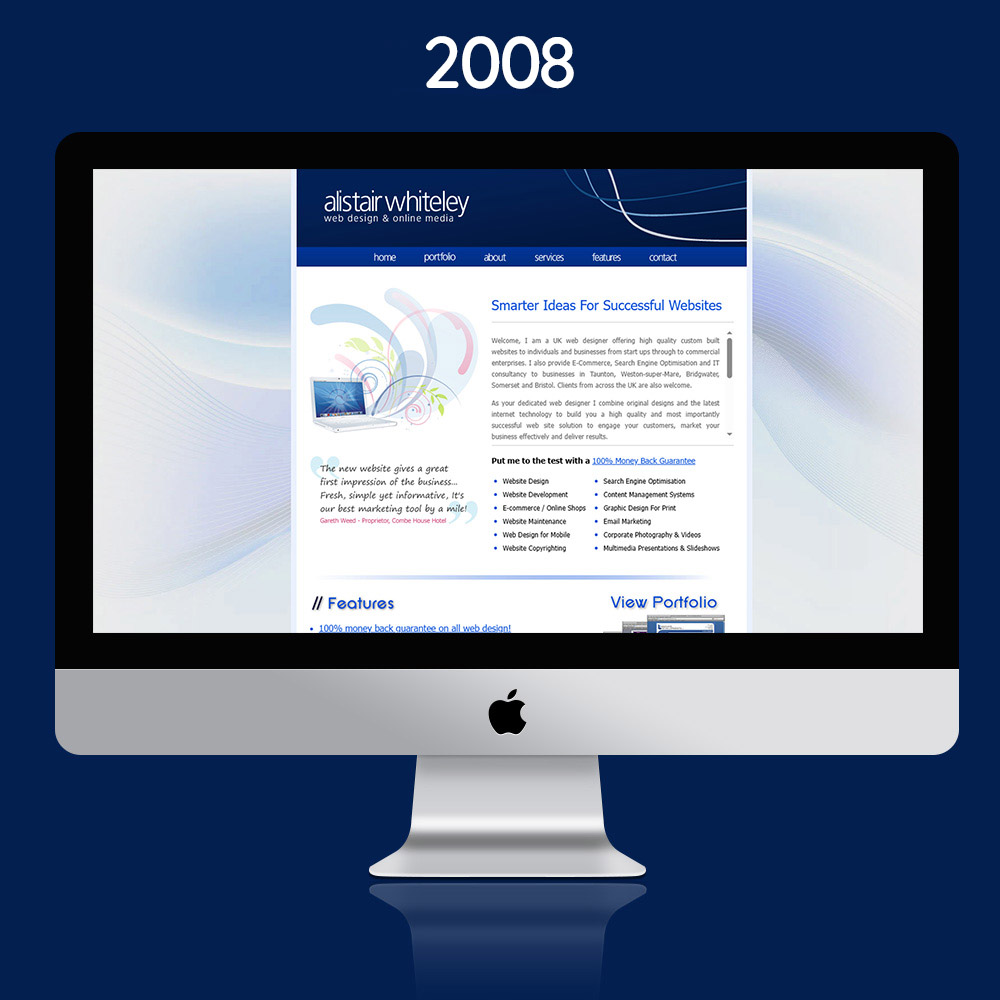
The 2008 Website.
In 2008, I took the plunge and set up a web design business from home, Alistair Whiteley Web Design Ltd was born. I gradually built experience and the portfolio of work project by project. in 2008, websites were designed originally for desktop screens with my preference for clean, professional layouts with branded creative elements and graphics that highlighted the content in a user-friendly manner. Internet technology and infrastructure were still developing which meant that speed was always a consideration. At this stage I also developed my own custom-built CMS (content management system) and hand-coded all elements from scratch using coding languages including HTML or XHTML, CSS, PHP, MYSQL and Javascript.
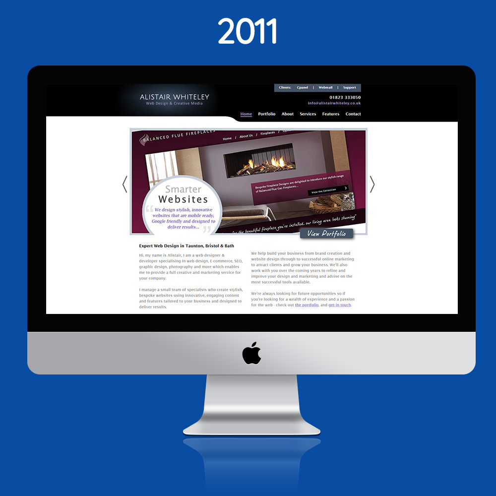
The 2011 Website.
3 years later design trends and preferences had moved on so I updated the branding and developed a new layout and design that not only worked for desktop but could also adapt the background elements more fluidly to different screen sizes.
The types of clients I was working with expanded and I started to develop our first E-commerce websites where businesses wanted to sell online to capture a wider audience.
My content management system had also developed and expanded to offer customers the ability to easily edit and manage content for pages, galleries, blogs, media, products and more.
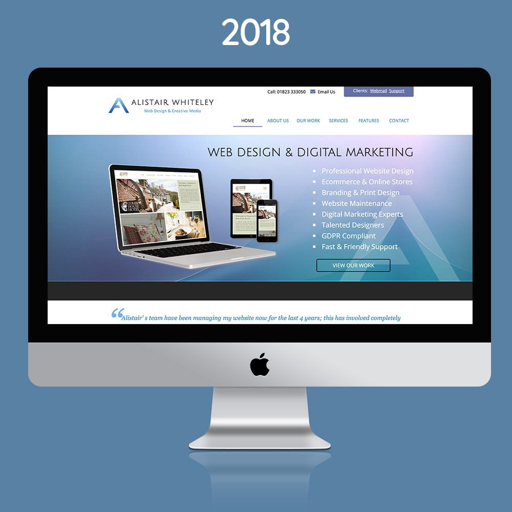
The 2018 Website.
The 2018 version of our website came with a further rebrand, utilising the logo we still use today with an iconic ‘A’ ident that was easily recognisable across all types of media. The website itself still had the same principles that I started with on day one with a clean, clear presentation of information.
This evolution of the design was now fully responsive, meaning that it would natively adapt to any screen size from the largest monitors to handheld tablets/iPads and mobile devices. This was one of the final hand-coded websites that I developed before fully adopting a move to the open-source website development platform WordPress. This offered us greater flexibility with the number of plugins and modules available to cater for expanding customer requirements.
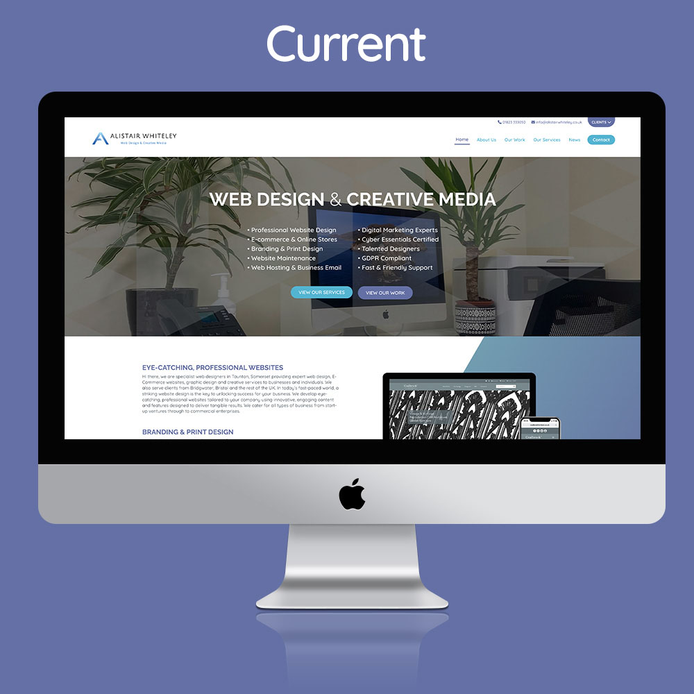
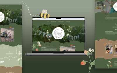
The Current Website.
Finally, we arrive at today’s website. Another fully responsive version and a bespoke design developed on the WordPress CMS platform. Today’s site offers more content and examples of work as well as a comprehensive blog of useful information, new projects, design trends, service details and more.
The company had also moved into the Enterprise Centre in the last 10 years, and new faces became part of the team with Chrissie our Web & Graphic designer still here today.
The next design of the website will no doubt be another step forward into the next wave of technology and design, with AI having a bigger part to play. Stay tuned for more…

